Color Resources
Introduction
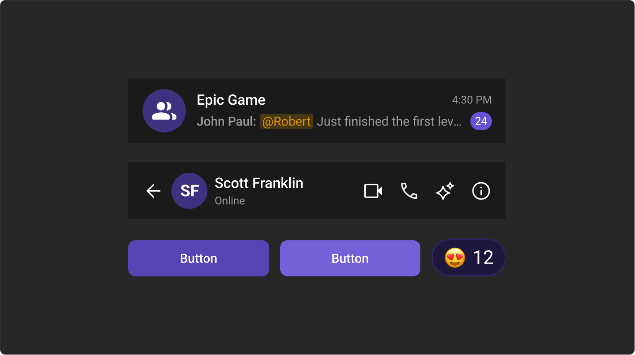
The Chat UI Kit features a carefully crafted color palette designed for a consistent and visually appealing user experience. It follows the Block, Element, Modifier (BEM) methodology, ensuring scalable styling and easy customization by overriding the Kit’s CSS variables.
Color Palette
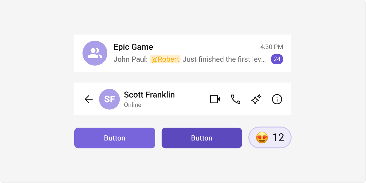
The primary color defines key actions, branding, and UI elements, while the extended primary palette provides variations for supporting components.
Primary Color
Light Mode
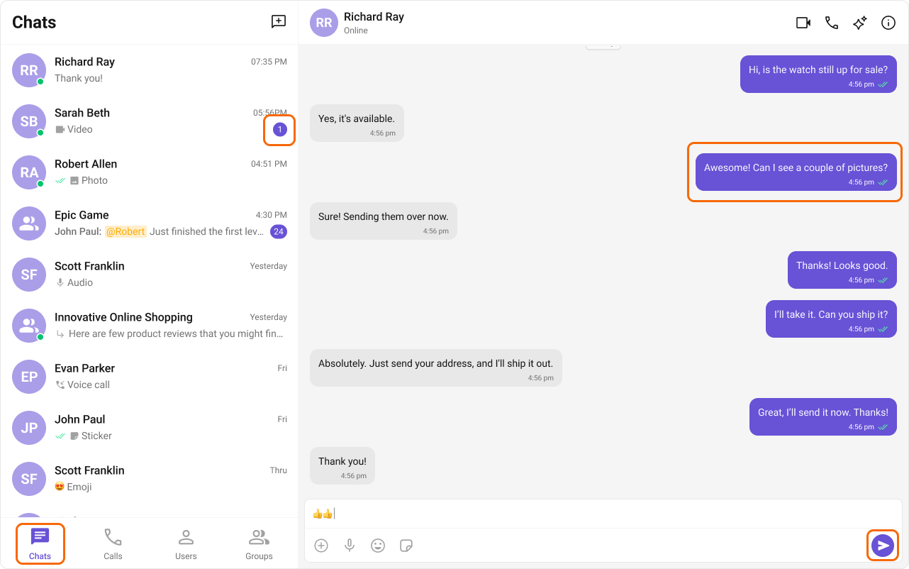
--cometchat-primary-color: #6852d6;
--cometchat-extended-primary-color-50: #f9f8fd;
--cometchat-extended-primary-color-100: #edeafa;
--cometchat-extended-primary-color-200: #dcd7f6;
--cometchat-extended-primary-color-300: #ccc4f1;
--cometchat-extended-primary-color-400: #bbb1ed;
--cometchat-extended-primary-color-500: #aa9ee8;
--cometchat-extended-primary-color-600: #9a8be4;
--cometchat-extended-primary-color-700: #8978df;
--cometchat-extended-primary-color-800: #7965db;
--cometchat-extended-primary-color-900: #5d49be;
Dark Mode
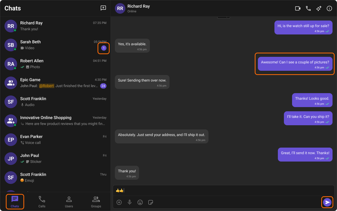
--cometchat-primary-color: #6852d6;
--cometchat-extended-primary-color-50: #15102b;
--cometchat-extended-primary-color-100: #1d173c;
--cometchat-extended-primary-color-200: #251e4d;
--cometchat-extended-primary-color-300: #2e245e;
--cometchat-extended-primary-color-400: #362b6f;
--cometchat-extended-primary-color-500: #3e3180;
--cometchat-extended-primary-color-600: #473892;
--cometchat-extended-primary-color-700: #4f3ea3;
--cometchat-extended-primary-color-800: #5745b4;
--cometchat-extended-primary-color-900: #7460d9;
Extended Primary Colors
Light Mode
Dark Mode