Group Members
Overview
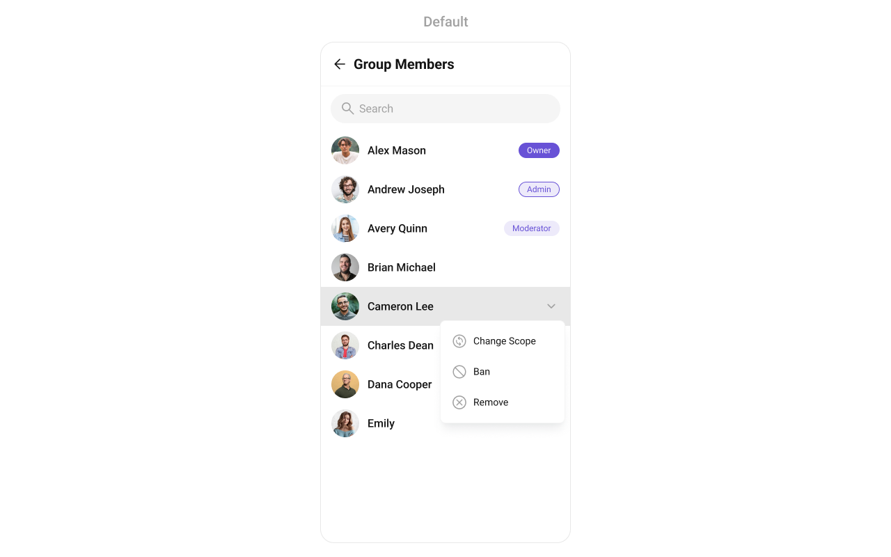
CometChatGroupMembers is a versatile Component designed to showcase all users who are either added to or invited to a group, thereby enabling them to participate in group discussions, access shared content, and engage in collaborative activities. Group members have the capability to communicate in real-time through messaging, voice and video calls, and various other interactions. Additionally, they can interact with each other, share files, and join calls based on the permissions established by the group administrator or owner.
Usage
Integration
CometChatGroupMembers, as a Composite Component, offers flexible integration options, allowing it to be launched directly via button clicks or any user-triggered action. Additionally, it seamlessly integrates into tab view controllers. With group members, users gain access to a wide range of parameters and methods for effortless customization of its user interface.
The following code snippet exemplifies how you can seamlessly integrate the GroupMembers component into your application.
If you're defining the Group members within the XML code, you'll need to extract them and set them on the Group object using the appropriate method.
- App.tsx
import { CometChat } from "@cometchat/chat-sdk-react-native";
import { CometChatGroupsMembers } from "@cometchat/chat-uikit-react-native";

function App(): React.JSX.Element {
  const [group, setGroup] = useState<CometChat.Group | undefined>(undefined);

  const getGroup = async () => {
    const group = await CometChat.getGroup("guid");
    setGroup(group);
  };

  useEffect(() => {
    //login
    getGroup();
  });

  return (
    <>
      {group && <CometChatGroupsMembers group={group} />}
    </>
  );
}
Actions
Actions dictate how a component functions. They are divided into two types: Predefined and User-defined. You can override either type, allowing you to tailor the behavior of the component to fit your specific needs.
onItemPress
Function invoked when a user item is clicked, typically used to open a user profile or chat screen.
- App.tsx
import { CometChatGroupMembers } from "@cometchat/chat-uikit-react-native";
import { CometChat } from "@cometchat/chat-sdk-react-native";

const onPressHandler = (groupMember: CometChat.GroupMember) => {
  //code
};

return <CometChatGroupMembers onItemPress={onPressHandler} />;
onnItemLongPress
Function executed when a user item is long-pressed, allowing additional actions like delete or block.
- App.tsx
import { CometChatGroupMembers } from "@cometchat/chat-uikit-react-native";
import { CometChat } from "@cometchat/chat-sdk-react-native";

const onLongPressHandler = (groupMember: CometChat.GroupMember) => {
  //code
};

return <CometChatGroupMembers onItemLongPress={onLongPressHandler} />;
onBack
OnBackPressListener is triggered when you press the back button in the app bar. It has a predefined behavior; when clicked, it navigates to the previous activity. However, you can override this action using the following code snippet.
- App.tsx
import { CometChatGroupMembers } from "@cometchat/chat-uikit-react-native";

const onBackHandler = () => {
  //code
};

return <CometChatGroupMembers showBackButton={true} onBack={onBackHandler} />;
onSelection
Called when a item from the fetched list is selected, useful for multi-selection features.
- App.tsx
import { CometChatGroupMembers } from "@cometchat/chat-uikit-react-native";
import { CometChat } from "@cometchat/chat-sdk-react-native";

const onSelectionHandler = (selection: Array<CometChat.GroupMember>) => {
  //code
};

return (
  <CometChatGroupMembers
    selectionMode={"single"}
    onSelection={onSelectionHandler}
  />
);
onError
This action doesn't change the behavior of the component but rather listens for any errors that occur in the Users component.
- App.tsx
import { CometChatGroupMembers } from "@cometchat/chat-uikit-react-native";
import { CometChat } from "@cometchat/chat-sdk-react-native";

const onErrorHandler = (error: CometChat.CometChatException) => {
  console.log("Error");
};

return <CometChatGroupMembers onError={onErrorHandler} />;
Filters
Filters allow you to customize the data displayed in a list within a Component. You can filter the list based on your specific criteria, allowing for a more customized. Filters can be applied using RequestBuilders of Chat SDK.
1. GroupsRequestBuilder
The GroupMembersRequestBuilder enables you to filter and customize the group members list based on available parameters in GroupMembersRequestBuilder. This feature allows you to create more specific and targeted queries when fetching groups. The following are the parameters available in GroupMembersRequestBuilder
| Methods | Type | Description |
|---|---|---|
| setLimit | number | sets the number of group members that can be fetched in a single request, suitable for pagination |
| setSearchKeyword | string | used for fetching group members matching the passed string |
| setScopes | Array<string> | used for fetching group members based on multiple scopes |
Example
In the example below, we are applying a filter to the Group List based on limit and scope.
- App.tsx
import { CometChat } from "@cometchat/chat-sdk-react-native";
import { CometChatGroupsMembers } from "@cometchat/chat-uikit-react-native";

function App(): React.JSX.Element {
  const [group, setGroup] = useState<CometChat.Group | undefined>(undefined);
  let groupMemberRequestBuilder;

  const getGroup = async () => {
    const group = await CometChat.getGroup("mrc-uid");
    groupMemberRequestBuilder = new CometChat.GroupMembersRequestBuilder(
      group.getGuid()
    ).setScopes(["admin"]);
    setGroup(group);
  };

  useEffect(() => {
    //login
    getGroup();
  });

  const onErrorHandler = (error: CometChat.CometChatException) => {
    //code
  };

  return (
    <>
      {group && (
        <CometChatGroupsMembers
          group={group}
          groupMemberRequestBuilder={groupMemberRequestBuilder}
        />
      )}
    </>
  );
}
2. SearchRequestBuilder
The SearchRequestBuilder uses GroupMembersRequestBuilder enables you to filter and customize the search list based on available parameters in GroupMembersRequestBuilder. This feature allows you to keep uniformity between the displayed Group Members List and searched Group Members List.
Example
- App.tsx
import { CometChat } from "@cometchat/chat-sdk-react-native";
import { CometChatGroupsMembers } from "@cometchat/chat-uikit-react-native";

function App(): React.JSX.Element {
  const [group, setGroup] = useState<CometChat.Group | undefined>(undefined);
  let searchRequestBuilder;

  const getGroup = async () => {
    const group = await CometChat.getGroup("mrc-uid");
    searchRequestBuilder = new CometChat.GroupMembersRequestBuilder(
      group.getGuid()
    )
      .setScopes(["admin"])
      .setSearchKeyword("some-search-keyword");
    setGroup(group);
  };

  useEffect(() => {
    //login
    getGroup();
  });

  return (
    <>
      {group && (
        <CometChatGroupsMembers
          group={group}
          groupMemberRequestBuilder={searchRequestBuilder}
        />
      )}
    </>
  );
}
Events
Events are emitted by a Component. By using event you can extend existing functionality. Being global events, they can be applied in Multiple Locations and are capable of being Added or Removed.
Events emitted by the Group Members component is as follows.
| Event | Description |
|---|---|
| ccGroupMemberBanned | Triggers when the group member banned from the group successfully |
| ccGroupMemberKicked | Triggers when the group member kicked from the group successfully |
| ccGroupMemberScopeChanged | Triggers when the group member scope is changed in the group |
- Adding Listeners
import { CometChatUIEventHandler } from "@cometchat/chat-uikit-react-native";

CometChatUIEventHandler.addGroupListener("GROUP_LISTENER_ID", {
  ccGroupMemberBanned: ({
    message,
    kickedUser,
    kickedBy,
    kickedFrom,
  }: {
    message: CometChat.BaseMessage,
    kickedUser: CometChat.User,
    kickedBy: CometChat.User,
    kickedFrom: CometChat.Group,
  }) => {
    //code
  },
  ccGroupMemberKicked: ({
    message,
    kickedFrom,
  }: {
    message: CometChat.BaseMessage,
    kickedFrom: CometChat.Group,
  }) => {
    //code
  },
  ccGroupMemberScopeChanged: ({
    action,
    updatedUser,
    scopeChangedTo,
    scopeChangedFrom,
    group,
  }) => {
    //code
  },
});
- Removing Listeners
import { CometChatUIEventHandler } from "@cometchat/chat-uikit-react-native";

CometChatUIEventHandler.removeGroupListener("GROUP_LISTENER_ID");
Customization
To fit your app's design requirements, you can customize the appearance of the Groups component. We provide exposed methods that allow you to modify the experience and behavior according to your specific needs.
Style
Using Style you can customize the look and feel of the component in your app, These parameters typically control elements such as the color, size, shape, and fonts used within the component.
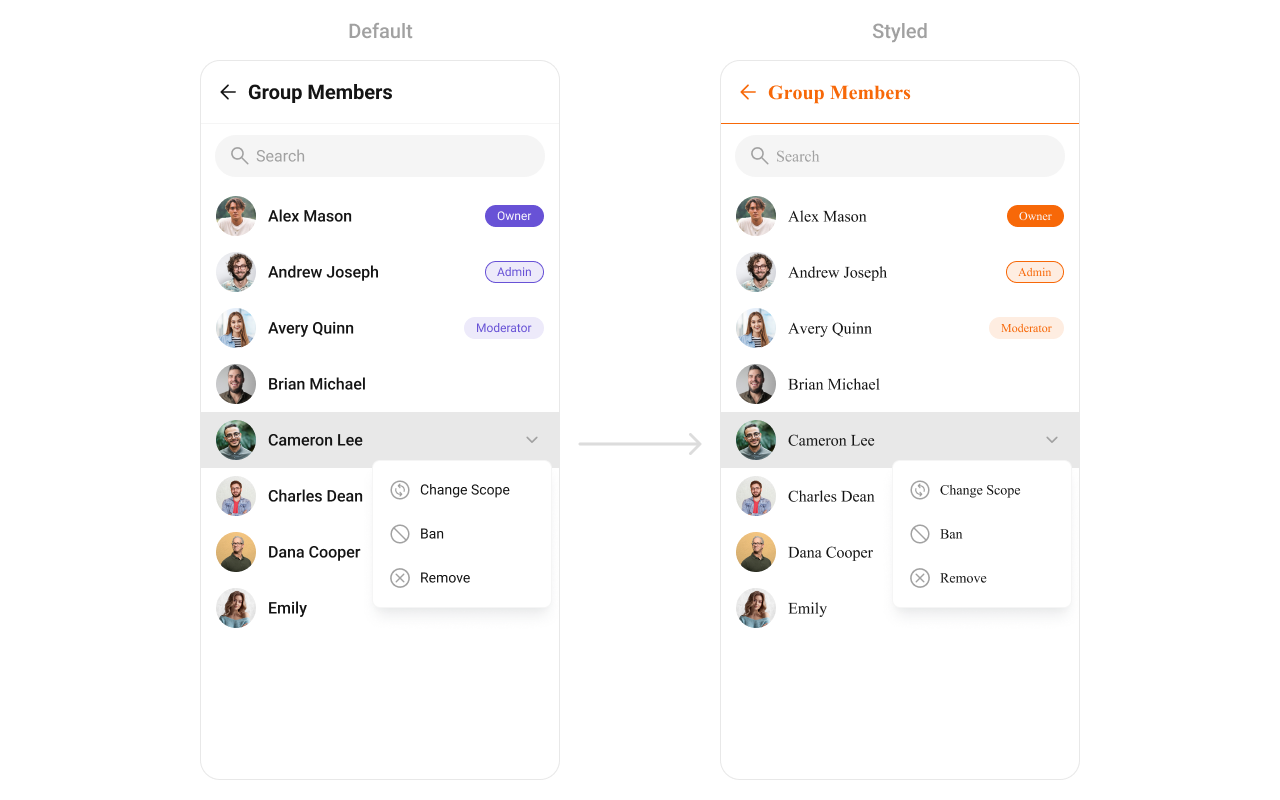
- App.tsx
import {
  CometChatGroupMembers,
  useTheme,
} from "@cometchat/chat-uikit-react-native";
//other imports
const theme: CometChatTheme = useTheme();
//code
return (
  group && (
    <CometChatGroupMembers
      group={group}
      style={{
        titleSeparatorStyle: {
          borderBottomColor: "#F76808",
        },
        titleStyle: {
          color: "#F76808",
        },
        backButtonIconStyle: {
          tintColor: "#F76808",
        },
        ownerBadgeStyle: {
          containerStyle: {
            backgroundColor: "#F76808",
            borderColor: "#F76808",
          },
          textStyle: {
            ...theme.typography.caption1.regular,
            color: theme.color.staticWhite,
          },
        },
        adminBadgeStyle: {
          containerStyle: {
            backgroundColor: "#FEEDE1",
            borderColor: "#F76808",
          },
          textStyle: {
            ...theme.typography.caption1.regular,
            color: "#F76808",
          },
        },
        moderatorBadgeStyle: {
          containerStyle: {
            backgroundColor: "#FEEDE1",
          },
          textStyle: {
            ...theme.typography.caption1.regular,
            color: "#F76808",
          },
        },
      }}
    />
  )
);
Functionality
These are a set of small functional customizations that allow you to fine-tune the overall experience of the component. With these, you can toggle the visibility of UI elements.
Below is a list of customizations along with corresponding code snippets
| Property | Description | Code |
|---|---|---|
| showBackButton | Used to show or hide back button | showBackButton={true}?: boolean |
| hideError | Used to hide error on fetching groups | hideError?: boolean |
| hideSearch | Used to toggle visibility for search box | hideSearch?: boolean |
| searchPlaceholderText | Used to set custom search placeholder text | searchPlaceholderText='Custom Search PlaceHolder' |
| selectionMode | set the number of group members that can be selected, SelectionMode can be single, multiple or none. | selectionMode?: 'none' | 'single' | 'multiple' |
| group | Used to pass group object of which group members will be shown | group: CometChat.Group |
| hideHeader | Used to toggle visibility for the toolbar/header | hideHeader?: boolean |
Advanced
For advanced-level customization, you can set custom views to the component. This lets you tailor each aspect of the component to fit your exact needs and application aesthetics. You can create and define your own views, layouts, and UI elements and then incorporate those into the component.
The Group Memebers component does not provide additional functionalities beyond this level of customization.
LoadingView
Displays a custom loading view while group members are being fetched.
Use Cases:
- Show a loading spinner with "Fetching group members...".
- Implement a skeleton loader for a smoother UI experience.
- App.tsx
import { CometChatGroupMembers } from "@cometchat/chat-uikit-react-native";
//code
const getLoadingView = (): JSX.Element => {
  //your custom loading view
  //return jsx;
};
return (
  <CometChatGroupMembers
    group={group}
    LoadingView={getLoadingView}
  />
);
EmptyView
Configures a view to be displayed when no group members are found.
Use Cases:
- Display a message like "No members in this group yet.".
- Show a button to Invite Members.
- App.tsx
import { CometChatGroupMembers } from "@cometchat/chat-uikit-react-native";
//code
const getEmptyView = (): JSX.Element => {
  //your custom Empty view
  //return jsx;
};
return (
  <CometChatGroupMembers
    group={group}
    EmptyView={getEmptyView}
  />
);
ErrorView
Defines a custom error state view when there is an issue loading group members.
Use Cases:
- Display a retry button with "Failed to load members. Tap to retry.".
- Show an illustration for a better user experience.
- App.tsx
import { CometChatGroupMembers } from "@cometchat/chat-uikit-react-native";
//code
const getErrorView = (): JSX.Element => {
  //your custom Error view
  //return jsx;
};
return (
  <CometChatGroupMembers
    group={group}
    ErrorView={getErrorView}
  />
);
LeadingView
Sets a custom leading view for each group member item, usually used for profile images or avatars.
Use Cases:
- Show a circular avatar with an online/offline indicator.
- Add a role-based badge (Admin, Moderator, Member).
- App.tsx
import { CometChatGroupMembers } from "@cometchat/chat-uikit-react-native";
import { CometChat } from "@cometchat/chat-sdk-react-native";
//code
const getLeadingView = (groupMember: CometChat.GroupMember): JSX.Element => {
  //your custom Leading view
  //return jsx;
};
return (
  <CometChatGroupMembers
    group={group}
    LeadingView={getLeadingView}
  />
);
TitleView
Customizes the title view, typically displaying the member's name.
Use Cases:
- Customize fonts, colors, or styles for usernames.
- Add role-specific indicators like "(Group Admin)".
- App.tsx
import { CometChatGroupMembers } from "@cometchat/chat-uikit-react-native";
import { CometChat } from "@cometchat/chat-sdk-react-native";
//code
const getTitleView = (groupMember: CometChat.GroupMember): JSX.Element => {
  //your custom title view
  //return jsx;
};
return (
  <CometChatGroupMembers
    group={group}
    TitleView={getTitleView}
  />
);
ItemView
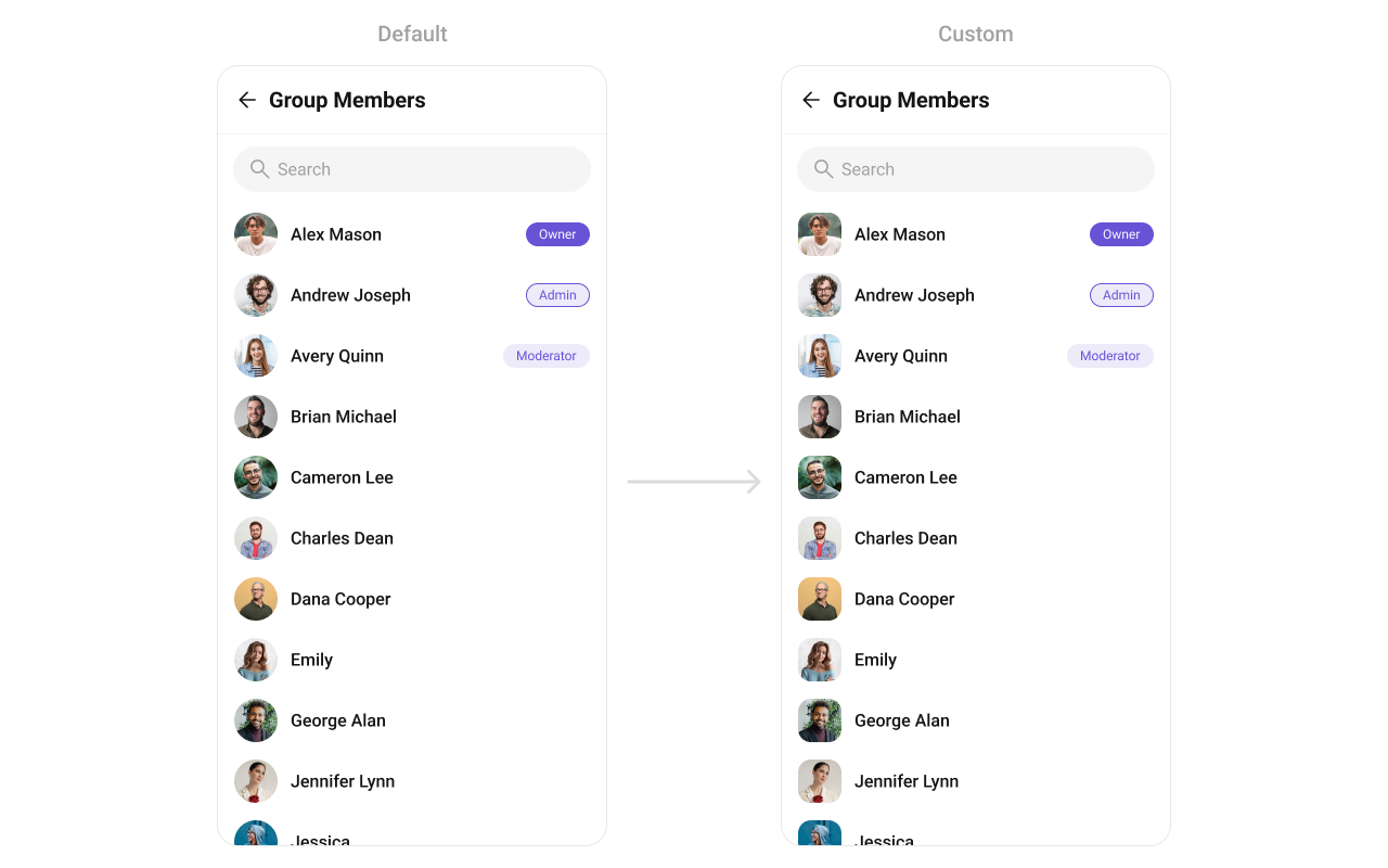
Assigns a fully custom ListItem layout to the Group Members Component, replacing the default structure.
Use Cases:
- Include additional member details like joined date, bio, or status.
- Modify layout based on user roles.
- App.tsx
import { CometChatGroupMembers } from "@cometchat/chat-uikit-react-native";
import { CometChat } from "@cometchat/chat-sdk-react-native";
//code
const getItemView = (groupMember: CometChat.GroupMember): JSX.Element => {
  //your custom item view
  //return jsx;
};
return (
  <CometChatGroupMembers
    group={group}
    ItemView={getItemView}
  />
);
Example
SubtitleView
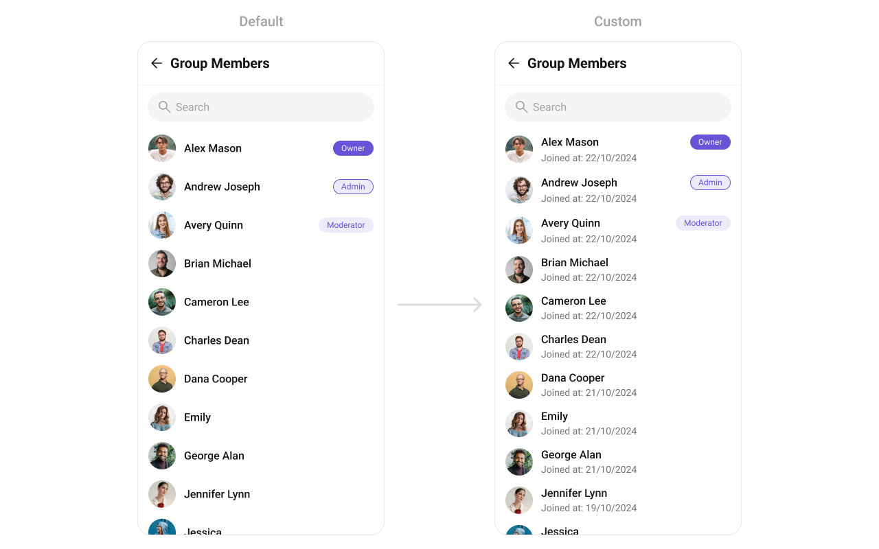
Customizes the subtitle view for each group member, typically used for extra details.
Use Cases:
- Show "Last Active" time.
- Display a custom status message.
- App.tsx
import { CometChatGroupMembers } from "@cometchat/chat-uikit-react-native";
import { CometChat } from "@cometchat/chat-sdk-react-native";
//code
const getSubtitleView = (groupMember: CometChat.GroupMember): JSX.Element => {
  //your custom Subtitle view
  //return jsx;
};
return (
  <CometChatGroupMembers
    group={group}
    SubtitleView={getSubtitleView}
  />
);
Example
TrailingView
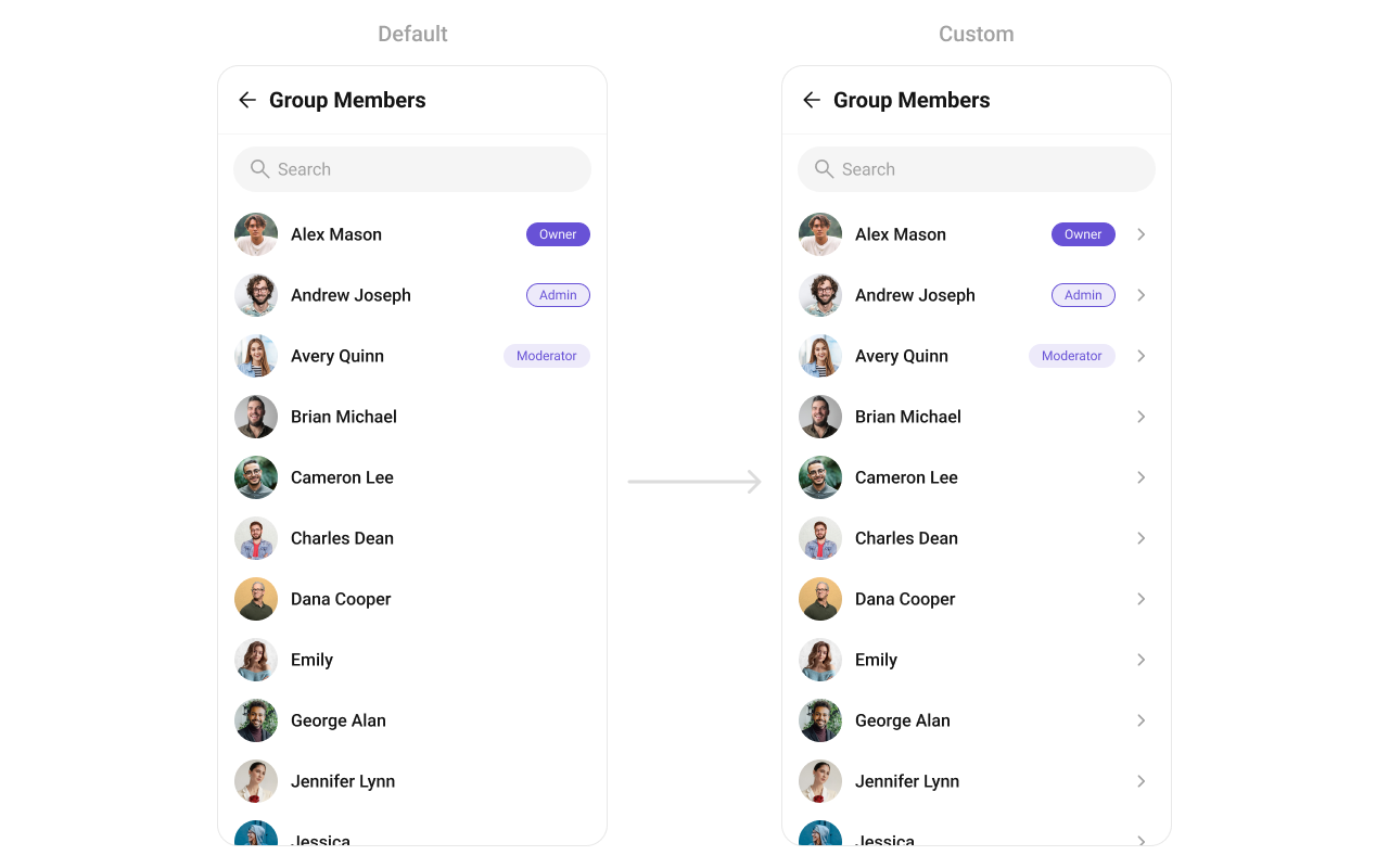
Customizes the trailing (right-end) section of each member item, typically used for action buttons.
Use Cases:
- Show quick actions like Mute, Remove, or Promote.
- Display a "Last Active" timestamp.
- App.tsx
import { CometChatGroupMembers } from "@cometchat/chat-uikit-react-native";
import { CometChat } from "@cometchat/chat-sdk-react-native";
//code
const getTrailingView = (groupMember: CometChat.GroupMember): JSX.Element => {
  //your custom Trailing view
  //return jsx;
};
return (
  <CometChatGroupMembers
    group={group}
    TrailingView={getTrailingView}
  />
);
Example
AppBarOptions
Allows customization of the overflow menu (three-dot ⋮ icon) with additional options.
Use Cases:
- Add extra actions like "Report Member", "Restrict from Posting".
- Provide group admins with moderation options.
- App.tsx
import { CometChatGroupMembers } from "@cometchat/chat-uikit-react-native";
import { CometChat } from "@cometchat/chat-sdk-react-native";
//code
const getTrailingView = (groupMember: CometChat.GroupMember): JSX.Element => {
  //your custom Trailing view
  //return jsx;
};
return (
  <CometChatGroupMembers
    group={group}
    AppBarOptions={() => {
      return (
        <TouchableOpacity
          onPress={() => {
            //do something
          }}
        >
          <Text>Custom App Bar Options</Text>
        </TouchableOpacity>
      );
    }}
  />
);
options
Defines a set of available actions that users can perform when they interact with a group member item.
- Provide actions like "View Profile", "Send Message", "Remove from Group".
- Restrict certain actions to admins (e.g., "Promote to Admin", "Ban User").
By customizing these options, developers can provide a streamlined and contextually relevant user experience
- App.tsx
import { CometChatGroups } from "@cometchat/chat-uikit-react-native";
//code

const setMyOptions = (_member: any, _group: any) => {
    return [
      //options
    ];
  };


return (
  <CometChatGroupMembers
    options={setMyOptions}
  />
);
addOptions
This method extends the existing set of actions available when users long press a group item. Unlike setOptionsDefines, which replaces the default options, addOptionsAdds allows developers to append additional actions without removing the default ones. Example use cases include:
- Adding a "Report Spam" action
- Introducing a "Save to Notes" option
- Integrating third-party actions such as "Share to Cloud Storage"
This method provides flexibility in modifying user interaction capabilities.
- App.tsx
import { CometChatGroups } from "@cometchat/chat-uikit-react-native";
//code

const addOptions = (_member: any, _group: any) => {
    return [
      //options
    ];
  };


return (
  <CometChatGroupMembers
    addOptions={addOptions}
  />
);